Design &
Social Impact
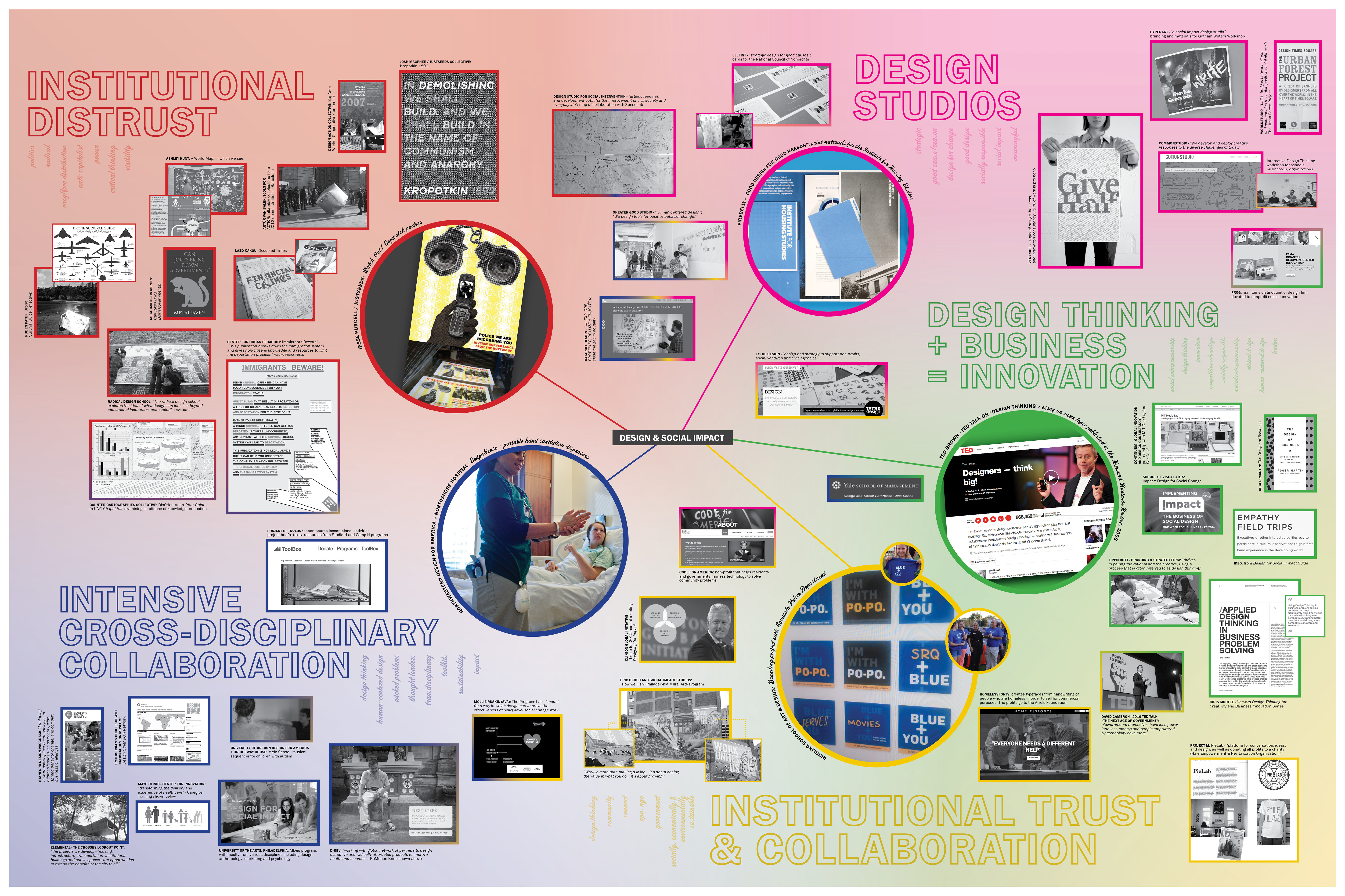
Mapping is a generative act that I find helpful for research, brainstorming, and writing.
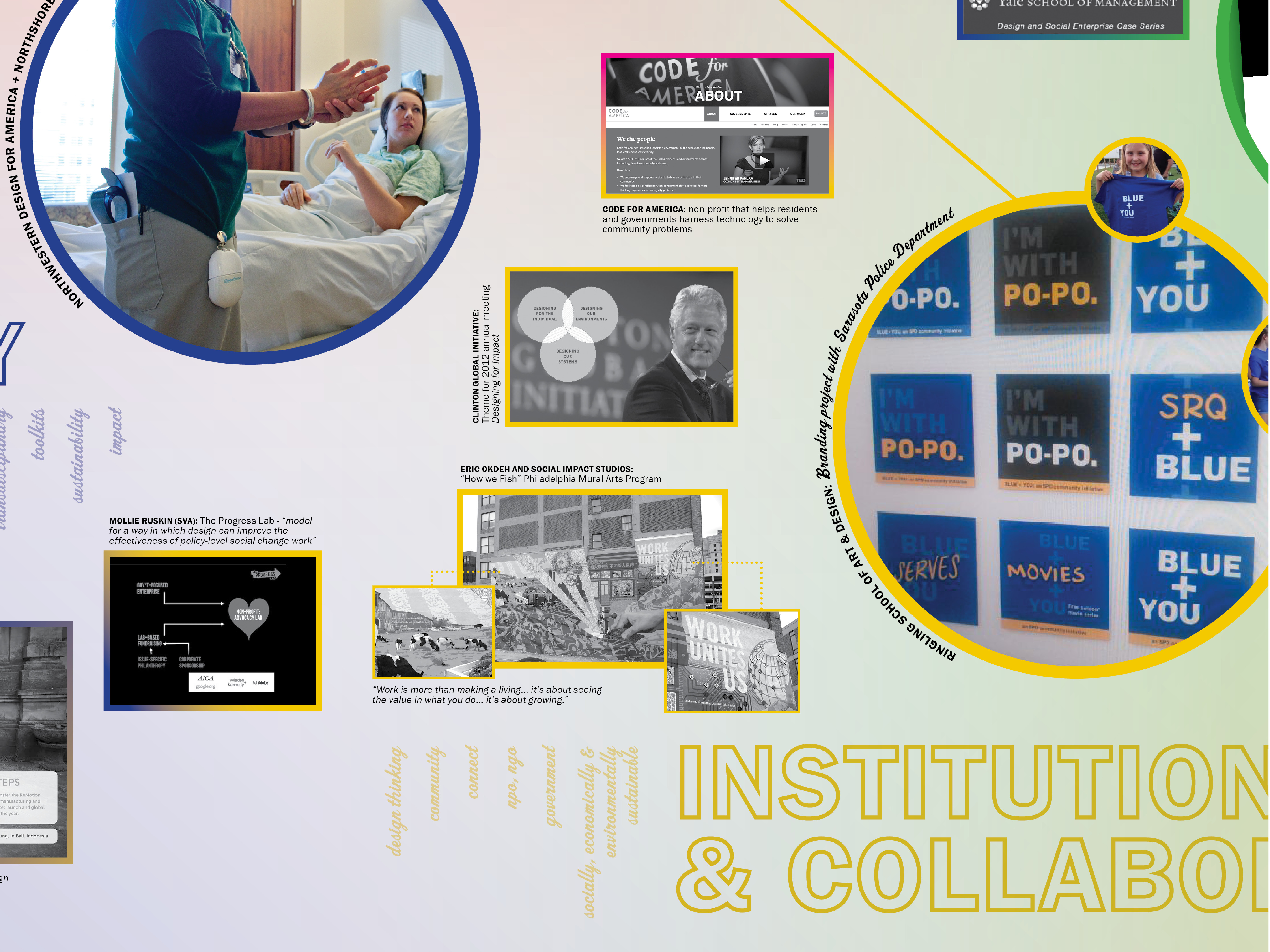
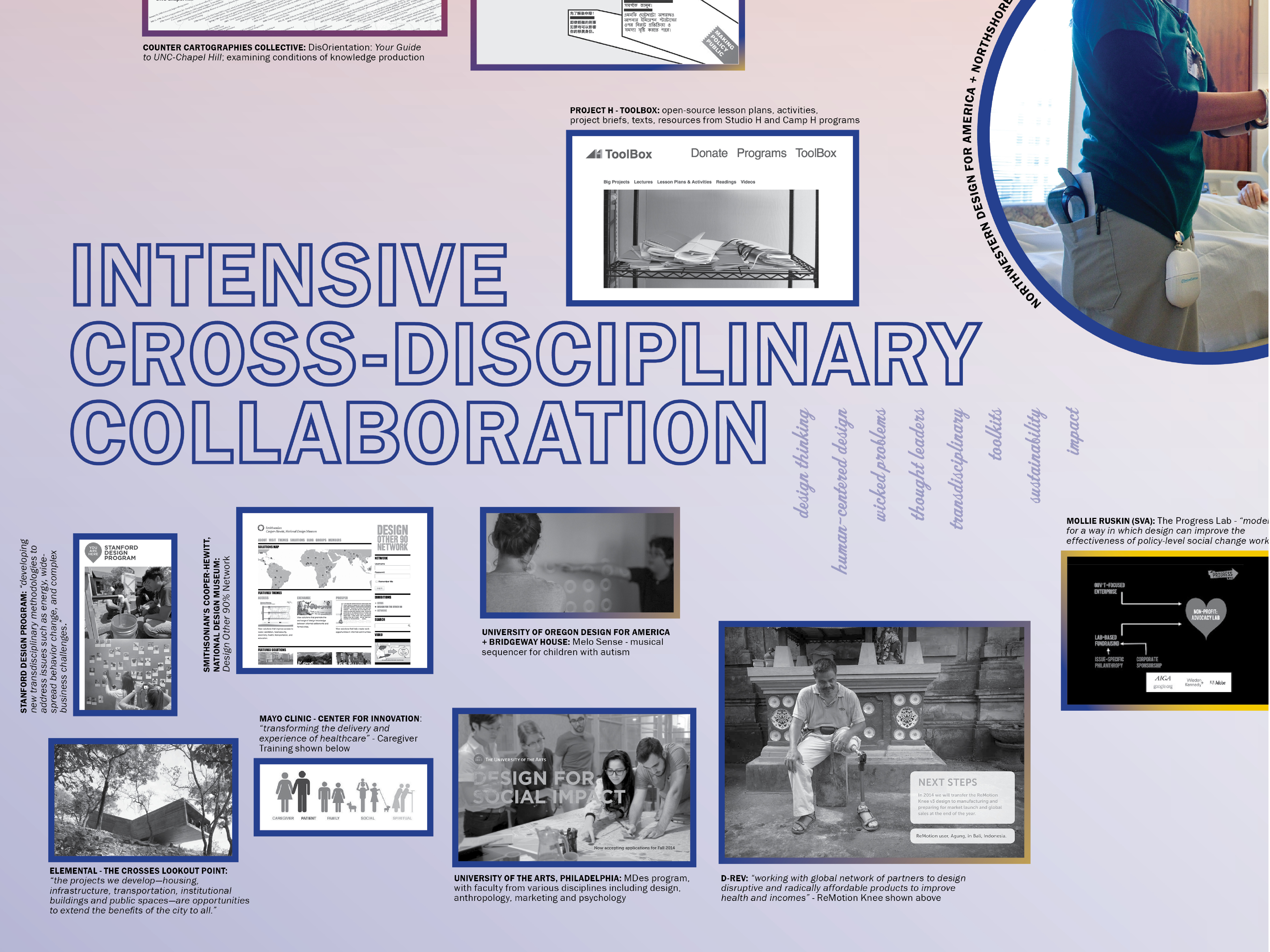
This particular map begins to chart the vast territory of what is commonly known as “social design” or “social impact design”—both to help my own understanding, as well as demonstrate an incoherence of this growing field. The map format allows for myself and viewers to visualize connections as well as stark differences, to see overlap and areas of ambiguity, and to more clearly identify critiques.
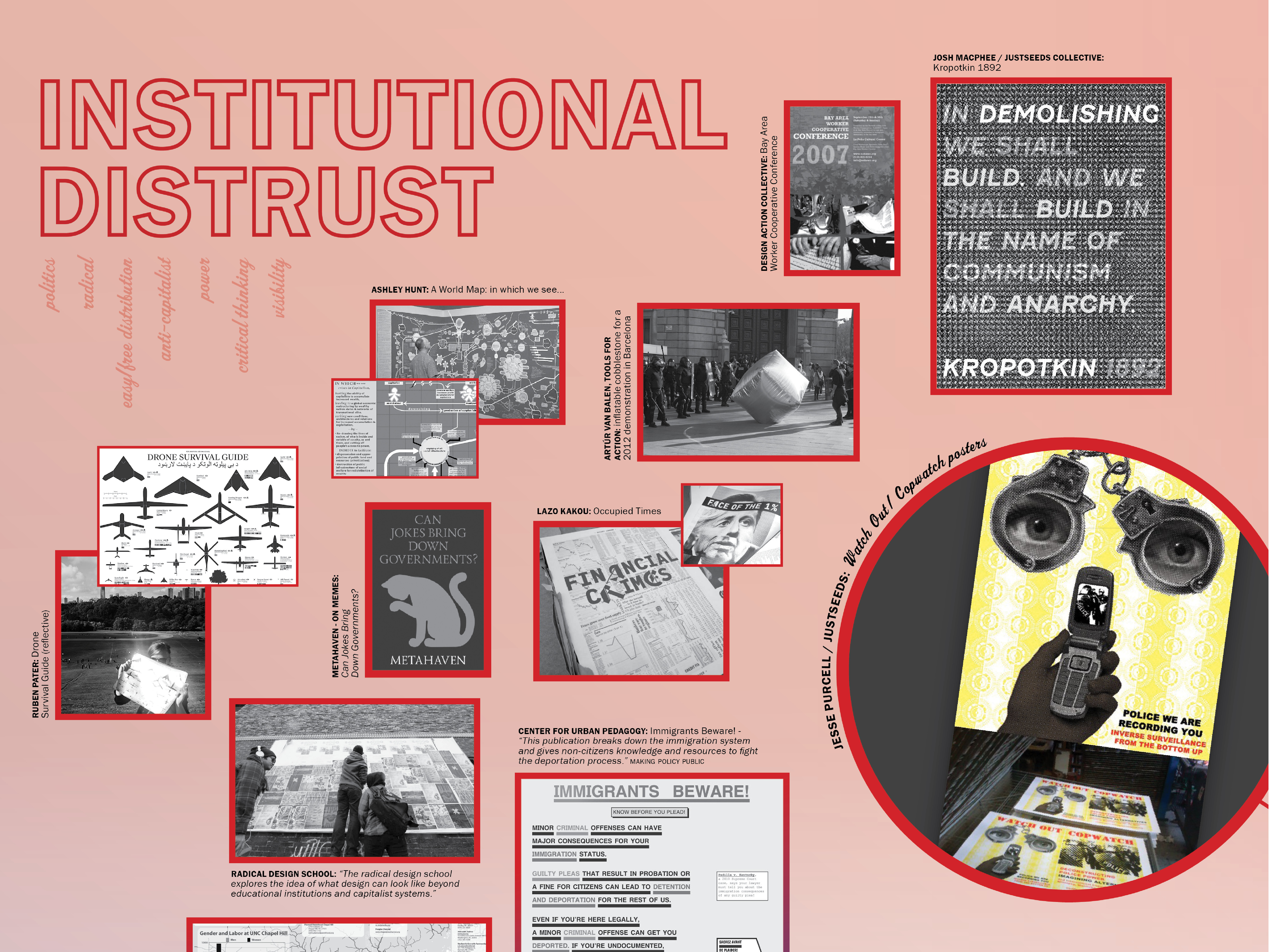
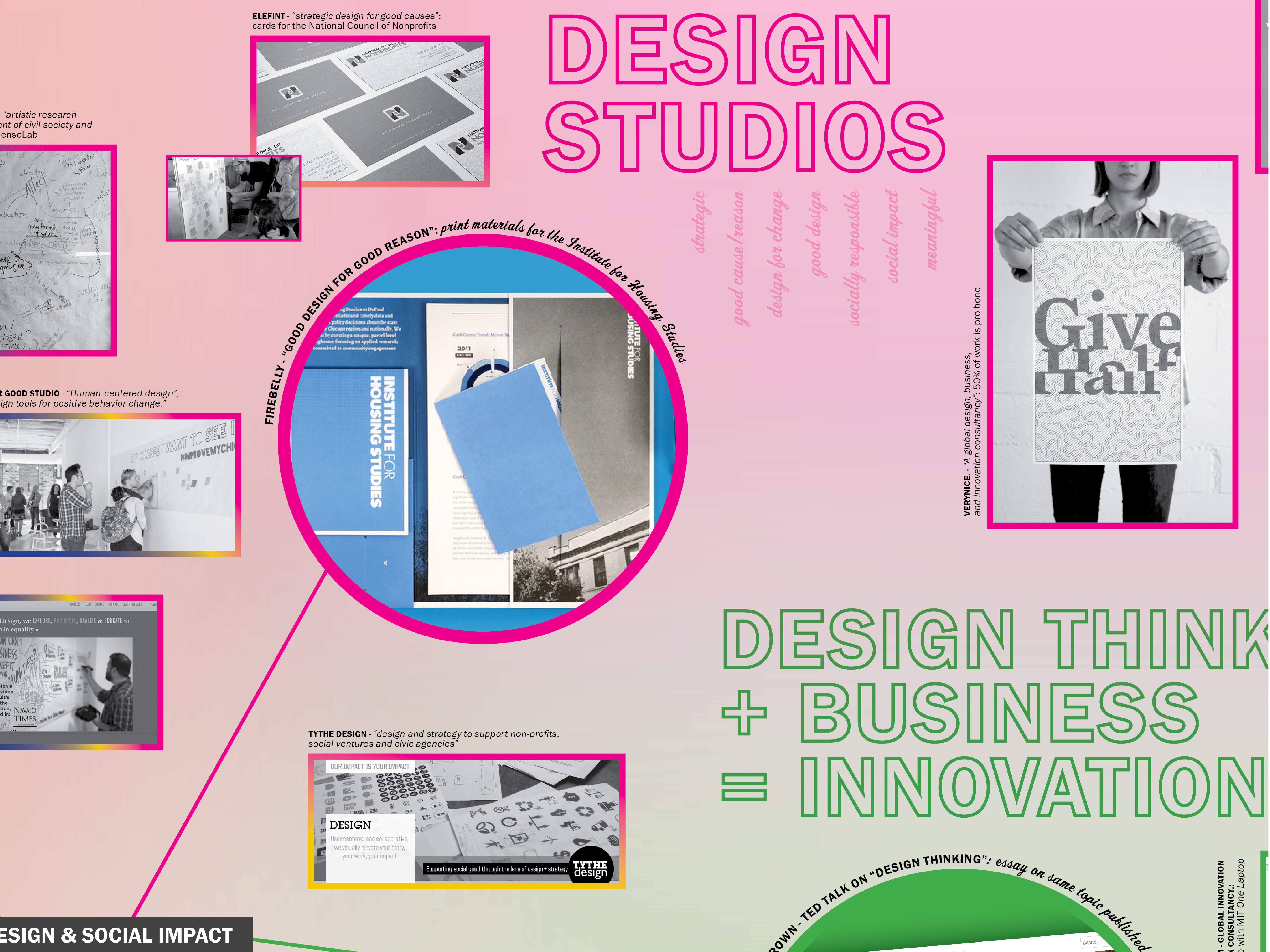
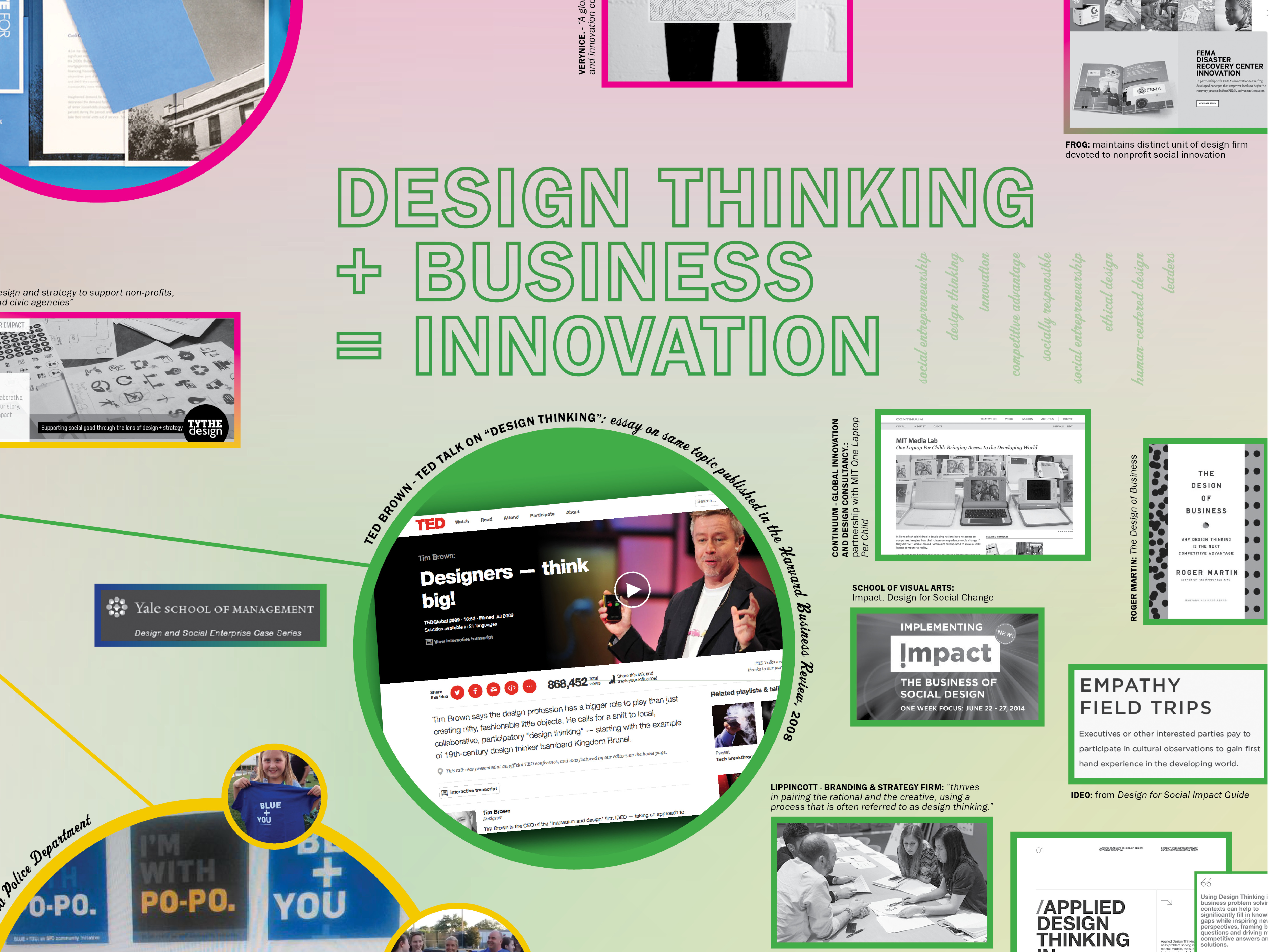
In the classroom an instructor might blur together: a handbook that provides accessible resources for understanding and fighting the deportation process, a design studio committing a chunk of their time to any non-profit work, and examples of progressive CEOs eager to integrate design thinking into their process.
There is a large swath of work here, and this ambiguity—in both rhetoric and the work produced/taught—is a problem. For those who take social activism seriously, my hope is not to be more narrow in terms of the work we do as designers, but to be more aware and articulate of the differences within the field. The phrase “social design” and its many variations are used interchangeably, without much care, in order to cover a lot of territories. This haziness makes it easier to push anything that’s essentially not corporate work into the “good” bucket, missing the subtlety of other kinds of violence or exploitation. Insights regarding power, state control, and privileges afforded by race, class, and gender should form a critical foundation for designers seeking to work in this growing field.
Digital print, 36" x 24". 2015.
This particular map begins to chart the vast territory of what is commonly known as “social design” or “social impact design”—both to help my own understanding, as well as demonstrate an incoherence of this growing field. The map format allows for myself and viewers to visualize connections as well as stark differences, to see overlap and areas of ambiguity, and to more clearly identify critiques.
In the classroom an instructor might blur together: a handbook that provides accessible resources for understanding and fighting the deportation process, a design studio committing a chunk of their time to any non-profit work, and examples of progressive CEOs eager to integrate design thinking into their process.
There is a large swath of work here, and this ambiguity—in both rhetoric and the work produced/taught—is a problem. For those who take social activism seriously, my hope is not to be more narrow in terms of the work we do as designers, but to be more aware and articulate of the differences within the field. The phrase “social design” and its many variations are used interchangeably, without much care, in order to cover a lot of territories. This haziness makes it easier to push anything that’s essentially not corporate work into the “good” bucket, missing the subtlety of other kinds of violence or exploitation. Insights regarding power, state control, and privileges afforded by race, class, and gender should form a critical foundation for designers seeking to work in this growing field.
Digital print, 36" x 24". 2015.